Composing a Design System
- Design System Basics
- Working with Colors and Gradients
- Managing Typography
- Spacings, Shapes and Shadows
- Theming and CompositionLocal
- Components
- Backward Compatibility and Migration
- Final Thoughts
Design System Basics
A Design System represents the blueprint of an app’s brand. Design cues often make an app recognisable, even when they are presented out of context. Consider logos of various brands and their color definition(Mcdonald’s M with yellow color, Facebook’s f with blue color). A Design System makes sure your user doesn’t feel alienated within your app as he traverses different flows of your product. Such a system is defined with very granular properties of Design: Colors and Typography with additional attributes such as shadows, shapes, spacings, gradients etc.
Working with Colors and Gradients
A UI framework can be easily judged by the way it handles design primitive properties such as Colors. Android XML failed miserably at this because the only way you could represent color in it was hex code. The number of times I have received rgba properties from Designers and I had to ask them please provide hex codes because that’s the only format we can support via XML, always felt stupid. Now don’t get me wrong, hex codes are easy and there are ways to convert rgba to hex easily whether it’s manual or automated, but it always made me feel I was speaking a different language than Designers.
Compose ditching XML means there is only one language left to define color which has a very good definition for the same.
//RGB with alpha
val color = Color(red = 0xFF, green = 0xFF, blue = 0xFF, alpha = 0xFF)
val color = Color(red = 1f, green = 1f, blue = 1f, alpha = 1f, ColorSpace.get(ColorSpaces.Srgb))

//ARGB Integer
val color = Color(0xFF000080)
Gradients
If you want to standardize gradients in your app, it’s hard. Here are few ways to create gradients in Android
- If you have a Vector, you can add a
<gradient>tag inside xml. Want to do this outside of xml, forget it. - Above step is same if you have an Shape xml.
- You can create
GradientDrawableprogrammatically, but it only takes specific shapes likeoval,rectangleetc.
Creating a central API to create/apply gradient with a shape/drawable is hard. The only way is to convert the whole Drawable to Bitmap, add shader to it and bam you get back gradient laden BitmapDrawable(YOLO)
Better ways are here. Compose abstracted away everything related to Drawable to Painter classes(This also helps avoid all issues with Drawables in general but that probably needs a different blog post).
Similar to Color, Compose has a Brush API which allows you to define how to paint the content. The API is very generic since you can create a Brush instance for Gradient or a Solid Color, very handy for creating an API where you don’t know whether the consumer of your component would apply a Solid Color or a Gradient.
Shape class allows you to define shapes as well without any correlation with how the shape will be painted.
Modifier.background(
    brush = Brush.linearGradient(listOf(startColor, endColor)),
    shape = CircleShape
)
By creating an extension on Modifier, this allows us to create a central API for applying design specific gradients abstracting out properties like angles, stops etc from end users.
Managing Typography
I’ve been developing applications since before xml support was added for font files. Before that, it was a constant effort around Typeface APIs to make sure custom fonts were managed and applied properly everywhere(Do you even Calligraphy bro 😛 ).
Ever since fonts got support for xml, managing styles for TextView was far better. The existing system still suffers from certain hiccups
- Setting styles programmatically using
setTextAppearancedoes not respect line height. - Classes like
EditTextsubclassTextViewand can apply the same styles. However line height behaviours are quite inconsistent when fields are editable, which even varies with API level or how your custom font defines it’s line height or even how many lines your editable is rendering.
Compose uses TextStyle to define a style which can then applied Text related composable functions
TextStyle(
    fontFamily = Font(R.font.maison_neue_book).toFontFamily(),
    fontSize = 12.sp,
    lineHeight = 16.sp,
    color = Color(0xFFFF323D)
)
TextStyle supports a variety of properties fontSynthesis, letterSpacing, baselineShift etc. I wasn’t even aware such things were possible until I looked at these classes😅
Spannable is now known as AnnotatedString which accepts SpanStyle and ParagraphStyles.
The larger improvement here is Text is text, it’s no longer a base class for Button, EditText (Composition over inheritance). Editable and Clickable behaviours are represented with different composables functions or Modifiers.
Spacings, Shapes and Shadows
Spacings
Compose introduces two new classes androidx.compose.ui.unit.Dp and androidx.compose.ui.unit.Px to define measurements. Spacings can be mapped using plain objects or classes depending whether they are theme dependent or not.
object Spacing {
    val spacingX = 4.dp
    ....
}
Shapes
Compose has its own Shape interface which can be used to define custom shapes. Concrete implementations are available such as CircleShape, RoundedCornerShape, CutCornerShape etc.
Shadows
Modifier.shadow(elevation = 4.dp, shape = RoundedCornerShape(4.dp))Since Compose uses Android’s canvas to draw shadow, support for colored shadows is not possible. Fake colored shadows can be drawn on canvas using Canvas composable.
Theming and CompositionLocal
Traditionally Android’s theming system is heavily dependent on XML. We would usually have a style file called AppTheme which is applied at an application or activity level and it would define all attributes such as colors which are used by layouts in XML.
The Android framework takes care of loading styles from AndroidManifest.xml and the loaded theme is stored inside the currently applicable Context. A simple example is when using light/dark theme you would traditionally use activity.setTheme and after that all layouts inflated can automatically query attributes which were defined in the theme.
Compose doesn’t follow such a mechanism because all properties around colors, typography and spacings are defined in Kotlin classes and not linked to Context.
Enter CompositionLocal (also known as Ambients previously).
CompositionLocal in a simple definition, is a Service locator which can be used to store and retrieve arbitrary values. But they come with goodies, when values inside these locals change Compose will trigger UI update(think dynamic theming without activity restart).
Since they are kind of Service Locators, it’s easy to shoot yourself in the foot with them due to lack of compile time checks. However they are extremely useful to define and store theme related data.
internal val LocalTypography = staticCompositionLocalOf { greenThemeLightTypography() }
internal val LocalColors = staticCompositionLocalOf { greenThemeLightColors() }
internal val LocalSpacing = staticCompositionLocalOf { greenThemeLightSpacing() }
CompositionLocal can be created using staticCompositionLocalOf or compositionLocalOf. The former should be used when you expect values inside them to be changed less often, which is true for themes since you might not expect themes to change very often(day/night).
Once we have a way to retrieve properties from locals, we can wrap them into a top level composable which would intialise these locals and its children would be our UI content.
fun AlohaTheme(
    currentTheme: AlohaThemeToken = AlohaThemeToken.GREEN_THEME_LIGHT,
    content: @Composable () -> Unit
) {
    val (alohaTypography, alohaColors, alohaSpacing) = when (currentTheme) { /*Logic to return types according to theme*/ }
    CompositionLocalProviders(
        LocalTypography provides alohaTypography,
        LocalColors provides alohaColors,
        LocalSpacing provides alohaSpacing
    ) {
        content()
    }
}

// Expose types
val AlohaColors
    @Composable get() = LocalColors.current

// Application UI
setContent {
    val currentTheme = remember { mutableStateOf(AlohaThemeToken.GREEN_THEME_LIGHT) }
    AlohaTheme(currentTheme = currentTheme.value) {
        // UI which can access colors using AlohaColors,
        // typography using AlohaTypography
    }
}
CompositionLocalProviders allows us to set values to CompositionLocals. Since our theme properties like Typography, Color and Spacing can change according to theme we use provides to bind values to LocalTypography, LocalColors and LocalSpacing. So if a composable requests current colors using LocalColors.current, it will receive color according to theme.
Components
If we take a look back at traditional Android UI, the framework provided a lot of customisable components such as Button, EditText and even more like RecyclerView, Card were provided via AppCompat. One of the behaviour common in a lot of these components was they were themed according to what theme OS was applying. For example a Button would look wildly different depending on which OS it was being rendered. For MaterialTheme, this was advently solved by MDC components which followed material guidelines irrespective of OS versions on which they were being rendered.
Compose builds components on the same concept where components are separated by a design layer defined by foundation and material packages.
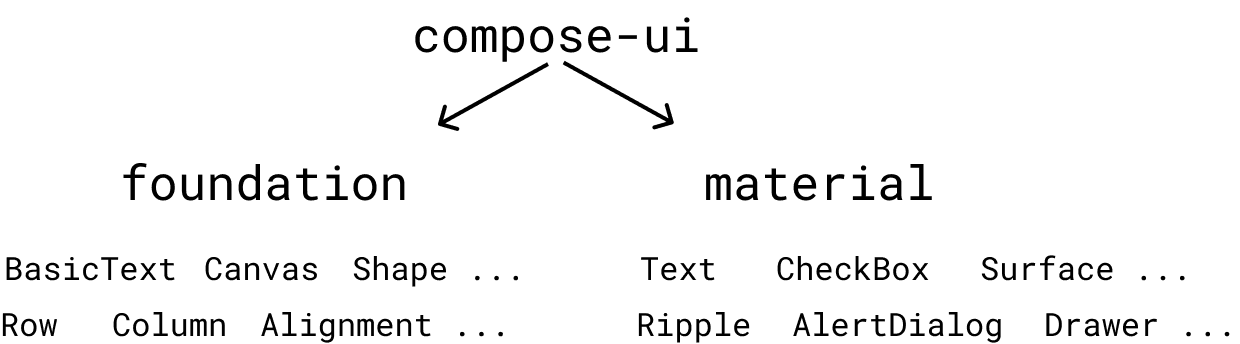
UI components within the Compose framework are divided into classes which make no assumptions around Theming such as BasicText and classes such as Text which expose LocalTextStyle as a CompositionLocal allowing them to be themed. This can be compared to color attributes such as colorControlActivated which we would use in traditional framework components such as Switch to theme it.
To Material or not
Since compose separates out Material components, if you try to build a Custom Design system with just foundation, the only components you will find yourself with are BasicText, BasicTextField and layout functions. Any other component like RadioButton, CheckBox, Switch etc will have to be built with scratch which is a departure from current situation where you could create custom versions of such components using AppCompatRadioButton, AppCompatCheckBox, SwitchCompat etc.
While this might look like a hiccup, it presents a larger question to creators of Custom Design System - whether you should accept Material behaviour inside your Design System. You can always compose a new Design System on top of MaterialTheme composable which would then allow you to create custom components as well as use existing Material ones. Here’s an example in Jetsnack sample
Material components use CompositionLocal heavily to define elevations, content colors as well as Interaction states are defined when MaterialTheme composable is initialised. While most of these properties and behaviours can be overridden, it must be understood these components have a default behaviour which is based on Material guidelines. If you have a Design System which defines custom interactions apart from colors and typographies, this is something which you should keep in mind if you compose your design system on top of Material’s implementation.
Backward Compatibility and Migration
While Compose is definitely an exciting new way to build UI, our existing traditional views are not going anywhere(probably for years!). Hence we must find a way to reuse existing styles and components wherever needed.
Theme
Material has an excellent example for keeping themes backward compatible using an adapter. This allows you to keep xml styles as source of truth and very useful if the UI screen is mix and match of both Traditional views and Compose UI Components.
Components
Existing view components can be converted to Composables using AndroidView composable.
@Composable
fun AlohaCheckBox(
    isChecked: Boolean,
    isEnabled: Boolean = true,
    onChecked: (checked: Boolean) -> Unit
) {
    AndroidView(factory = { context ->
        val alohaCheckBox = AlohaCheckBox(context = context) // Traditional UI view themed via style applied at activity/fragment level
        alohaCheckBox.isChecked = isChecked
        alohaCheckBox.isEnabled = isEnabled
        alohaCheckBox.setOnCheckedChangeListener { _, checked -> onChecked.invoke(checked) }
        return@AndroidView alohaCheckBox
    })
}
This provides a clear migration path for components since you can start off with re-writing components which can take advantage of Compose’s state management system and retrofit other components using AndroidView to be migrated later. AndroidView wrapped components can still define their APIs using a @Composable function whereas their underlying implementation can change later.
Final Thoughts
I had a lot of fun migrating our Design System to Compose. It definitely solves a lot of problems around abstractions and dynamic theming which plague the current theming system in Android. Compose’s modern nature is complemented by the fact that it’s APIs are named in such a manner, if you’ve used React, Bootstrap etc you might feel at home with concepts like Alignment, Arrangement etc and state management. There might remain a lot of unanswered questions as developers implement this framework in their apps but overall the experience should be refreshing!